The Book Mechanic
- ajmakesthings

- May 8, 2020
- 3 min read
Updated: May 11, 2020

Functionality
The technicalities of the book mechanic were decided prior to the development of Maive, however we found ourselves running into some issues in terms of shared vision and executing the mechanic in a fun but simple way.
Sid and I envisioned the book mechanic as more of a 2D side-scroller, that existed in projection form over the book itself, and the text of the story would exist within the environment to be read as the player went along. Kerris envisioned it as more of an animation above the book with Maive reading the poem beneath it. Somewhere between these two ideas was what we were looking for.
The trouble with my idea of the 2D side-scroller is that it depended on the character in the fable constantly moving to the right. In all of my poems there is at least one section in which the character is stationary, meaning the mechanic would have to change for those sections to accommodate: text would have to be able to be clicked through as well as encountered. Kerris also raised a question here - how could we know the player had read the text? This is when we came up with the idea to add interactive words in the texts. This would mean that the player would have to actively click on something to progress. This, in turn, removed the 2D side scrolling aspect, but gave more interactivity to the mechanic than a simple projection.
I scoured through my poems and found words that I thought would be good for interacting with - actions the characters made, objects of significance, etc.
Art
Alongside this development of the functionality of the mechanic, there was also the question of style. In keeping with my research in the first semester, my instinct was to favour a watercolour style with inked outlines. I tested this with a painting of a magpie that bordered on realism. It was immediately apparent that realism wasn't the way to go, with the style of the game being low poly and impressionistic, it clashed too hard for a style that was going to be appearing within the context of that world.
Instead, I decided to experiment with a watercolour version of low poly - drawing objects as though they were 2D captures of 3D shapes, and painting them with digital brushes that mimicked watercolour.
The effect was that the assets looked like paper origami, which was really appealing, however Kerris didn't like it and so I searched for an alternative.

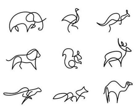
In searching for a clean style that wouldn't clash with the main world but contrasted it nicely, I came across minimalist one-line drawings. These background-less drawings has a really sleek, clean feel to them, and I mocked up some designs of the magpie and a tree based on other assets I'd found and my own experimentation. It was tricky to draw an entire picture without taking my pen off my screen at any point, but the results looked very deliberate and stylised. I made some screen tests to see if the style complemented the game, testing line colour and also what it might look like with the text from the poems on the screen.
As a team we agreed that the white glowing assets looked best, and that the style didn't clash with the game, which was really pleasing to hear.
From here I translated my poems into a list of assets and animations I needed to make. I deliberately made the animations for the book mechanic consist of very few frames and be played at a frame rate of no higher than 12fps. This was to give it that story-book feel, almost like a flip-book animation.


Comments