PHASE FOUR - Character Design
- ajmakesthings

- Dec 5, 2019
- 11 min read
Updated: Jan 16, 2020

As Maive embodies this game down to its title, it's crucial that her design is spot-on. Alongside that comes the characters that she interacts with, all of whom need to be visually appealing and have physical designs that reflect their personalities. Not only this, but they need to fit well within the world we are creating. Achieving all of these things is mine and Kerris' task, and with so much variation in terms of how we can go about designing characters, there's a lot of research and iteration to be done.
Maive
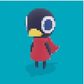
At the conception of this idea I mocked up some character designs for Maive that helped me to visualise what this project might become.

My justification for choosing the species of Maive can be found in my narrative design blog. However, there is more to these designs that needs to be addressed. For example, my initial inclusion of horns on each of the iterations was to experiment with the idea of creating a chimera character - one that is more than one species at once and would fall harder into the fantasy aspect of the game than simply animals. However, there are other ways to leave a fantastical imprint on a character's visual design, which is something I played with when giving Maive a cloak. In a fantasy setting, putting characters in a t-shirt and trousers seemed inappropriate, but the addition of a cloak humanised the character a little more, making them a person rather than just an animal. It was for this reason that I designed Maive up on her back legs instead of on all fours.
I also added a brooch that clasps the cloak together, which I designed in the shape of a scroll. This is to visually identify her as a travelling storyteller, which, as a profession in the context of the narrative, needs to have an accompanying "uniform" that other characters can recognise. My first experimentation of this was using the brooch.

I toyed around with colour palettes, too, wanting to creating something rich that matched the setting. Using a saturated palette of the red panda's colouring, I made the cloak green to contrast the dark orange. This also let me showcase the embroidered embellishment I imagined on her cloak, giving a luxurious appearance to the piece of clothing that felt at home within this imagined universe.
During development, and once I had decided on a red panda as the species for Maive, I passed off her development to Kerris for continuation.
General Character Design
Something I have found very helpful in this process is understanding how character design is undertaken by actual design studios. This blog post from game studio Bigumaku helps to outline the developers process in creating characters and some of the systems they use. Something of particular interest to me was Senior Artist, Elliott Kozlik's comments of eliminating ownership of a design. This has been a particularly fruitful thing to think about, as having the character design be an open development between me and Kerris has meant more and more creativity can be injected into the designs that one of us alone couldn't have achieved.
In terms of process, we experimented generally with visual designs to get a feel for things by creating lots of concept art, a process documented by Riot Games. Creating lots of concept art is a great way to create fast and experimental designs, cutting out the bad ideas and honing in on the good ones.

The character I experimented with was Lennie, the teenage leopard gecko with big dreams and a lot of attitude. My first designs of him was very much inspired by the actual lizard, with the species impacting the leg and arm shape as well as the iconic bloated tail. I iterated some head shapes, some closer to the actual gecko head shape and others more interpretive. Creating these designs also made him a more personable character than how I'd originally designed him.
The team had talked, however, about creating a body type that could be used for all of the characters in the game. This would make our development process quicker, as the scale of this game is quite large for a small team, and would mean we could save time in the modelling, rigging and animating processes.
We would need a design that suited all of the characters well, however I couldn't figure out how to achieve this with the peacock character, Garveet, so he might have to be designed separately.
When designing, I noticed being drawn to creating characters with larger heads and smaller bodies.

This is know as neoteny, which, in biology, refers to the retention of juvenile characteristics into adulthood. In design, this often "kiddifies" characters, especially humans, giving adults characteristics that make them appear "cuter". This can be used as a positive and a negative - neoteny makes us relate to a character in a maternal/paternal way, which in turn can make us protective of them, which can be useful in video games especially as it makes us invested in the success of the character. However, things like neoteny and its associate paedomorphism can have some harmful effects when it comes to sexualisation of children and forced immaturity on children, as discussed by Emma Joy Reay in her article on the subject.
Some of these issues are avoided, however, due to the fact that we have a cast of animal characters. Neotonised animal characters are a staple of anthropomorphism in media, with examples ranging from the characters in the Pokemon franchise to the cast of the Animal Crossing video game series.
So when it came to making a body type, having taken into consideration neoteny and its varying effects, we continued down our instinctual line in iteration in making the characters have larger heads and smaller bodies, appreciating the attachment that this creates for all audiences interacting with the game.
I did some research into different games and medias that use this in their characters.
Animal Crossing, Hokko Life, and Sylvanian Families all have characters with chunkier limbs and slightly distended bellies.


Night In The Woods and Sonic the Hedgehog and A Short Hike have characters with round bodies and long, skinny limbs.


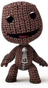
Sanrio characters and Sackboy from Little Big Planet have squarer, wider limbs that are less contrasting to their abdomens.


From this brief research, I mocked up a few designs and gathered feedback from people as to which they preferred.


The clear winners were designs 1 and 3, with some negative feedback on 2 specifically. Most people found the round bellies appealing, as well as limbs slightly more proportionate to the torso. Based on this feedback I combined designs 1 and 3 to create a base shape that Kerris and I could use for future character designs.
Clothing
Clothing was a difficult topic to broach on two fronts: the first being that this is a fantasy world set in no particular year or culture, and the second being that all of our characters are animals, and therefore the "rules" of clothing tend to change. We had no intention of putting the characters in a full outfit, however what they wore and why was something we had to decide on.
Kerris found a wonderful Instagram account of an artist who makes tiny figurines out of clay or felt. They all wear a piece of clothing, the design of which was very interesting to us, as it seemed unique and quirky without deviating from the fantasy style. They are also all handmade and bespoke, a feel that we want to capture in our character design.


My first attempt at designing clothing was with Lennie (see below), and went through many iterations. I began with a short-sleeved cloak with a hood, however this seemed too basic and didn't convey any of the character's personality. I then designed a tunic for him, with a studded belt to match, but it felt comical and still too plain. One I had nailed down his physical design, and with the addition of his colouring, I was a little more creative and thought outside the box, giving him a patchwork cloak, a pair of fishing overalls, or a tunic and an embroidered scarf, which fit well with his personal narrative.


With a general baseline for all the characters created, it was time to create specific designs.
Lennie
Much of my experimentation with Lennie has been documented above, however there are some decisions I've not justified. The first of these is the change in Lennie's head-shape, which followed the creation of the body template. I didn't feel the head-shape was fitting or representative of the leopard gecko, and so iterated some different shapes to find a better one.

Out of these designs I liked the second one best, feeling that is was the best caricature of a leopard gecko's head. From here I went ahead and designed Lennie some outfits, which I added colour to in an attempt to give them more personality. I also coloured Lennie himself, giving him classic markings and colourings of a leopard gecko. This really helped bring him to life.

- The first cloak is a simple patchwork displaying a lack of wealth. However, in my opinion, this is about the only thing that makes this outfit feel relevant to the character.
- The second cloak is far too regal and luxurious for the character, but I like the interesting layered design and it might be fitting for another character down the line.
- The third outfit is based on fisherman's overalls, as Lennie's family are fishermen. I like how relevant this outfit is, however the wellington boots don't feel like they fit the world we are making. Interesting as the design may be, it doesn't feel very "fantasy" to me.
- The fourth design is my favourite. The style of the clothes help to give Lennie a young appearance, and drawing the scarf gave me ideas of how to further flesh out his narrative. My idea was to have this scarf knitted for Lennie by his mother using the last of her wool, showing his mother's dedication and care for him. Lennie, however, interprets this as his mother being over-protective about the cold, fussing over him and not letting him have any freedom, showing clearly to the audience his negative interpretation of the world around him.
Without this backstory, I got feedback from a variety of different audiences on these four designs to see what they thought. I made sure to ask different ages and genders, ranging from 12-52 years. The design with the most support was design 4, however people also liked design 1. Sid brought up the fact that the cloak felt too similar to what Maive wears, and it would be nice to have some variety in terms of the outfits the characters wear. With that in mind, I chose design 4 for Lennie.
Garveet
Garveet was the second character I was tasked with designing. He is difficult in the sense that I can't use the body template for him, however having established a style and format for the characters, it was easy to use this outline and adjust it to fit Garveet's bird form.
I sketched his outline on top of the body template, flaring out at the belly, but narrowing and elongating the neck. I also made his head significantly smaller, as keeping it the same size as the template was comical. I used the same eyes for Garveet as I'd drawn for Lennie.
The challenge then came in deciding the side of his feathers. I drew up three different sizes, with the largest being closest to the actual proportions of a peacock, with a very large difference between feather size and body size, and the smallest not even cresting the height of his head.

Out of the three, I think that the second is the most appropriate for a video game character. It captures the splendour of the peacock without becoming unmanageable in size.

Whilst peacock's plumes are comprised of tiers of feathers, each with an eye-like marking at the top that when stacked forms a repeating pattern, I didn't want to over-clutter the visual design of the character. Instead I placed just one marking at the top of each section, making Garveet recognisably a peacock but keeping the design simple. I also added markings around his eyes, and a crown of feathers atop his head.
In colouring Garveet, I found a rich peacock colour palette which I tweaked to suit the other colours Kerris and I have used in our concept art.
In accordance with the narrative, I wanted Garveet to look luxurious and covered in fine things. I tried to weave this into the four outfit concepts I made for him, sticking to a purple/gold colour scheme to represent Garveet's own perceived sense of royalty.

The top left design is far too simple, but was a good starting point to inspire the others.

The bottom right design was inspired by this image of a necklace that Sid found. I liked the idea that Garveet collected all his jewels and set them in something that he could wear. I imagine him as the sort of character that would want to make a big, loud statement to those around him, however I think the design is too extravagant for the game that we are making.
I liked the top right and bottom left designs equally, enjoying the embroidered detail on the cloak in the third design but also liking the regal and a-typical design of the second design's cloak.
Having received feedback from others, those two designs were definitely the favourites.

I decided to combine the two, finding a reference for geometric borders and adding one along the border of the second cloak. I kept it the same colour as the cloak's golden bottom, giving it an effect that made it seem as though the pattern was creeping out of the gold. I think the clean cut, square pattern suits the character better than the free flowing embroidery.
The final design leans more towards the second outfit iteration, but combines some of the interest found in the third.

Turnarounds
For the purposes of semester 2, when we start modelling the characters, I had to create turnarounds for each of the characters that showed them from front, side and back angles. This would mean they could be imported into Blender and used as a template when modelling.
I'd never made a turnaround before, so I did some research into how to keep consistency by drawing lines that indicate the size of different aspects of the character.
I already had front-facing designs for all the characters, however, when translating them into turnarounds, I used Procreate's symmetry setting to make sure that the image was exactly symmetrical. This means that when creating the model in Blender, the modeller only needs to make half the model and then mirror it, making workflow more efficient. This symmetry could only be used to an extent, however, as often their clothes or aspects of their character were asymmetrical. For example, Garveet has two hanging threads on his cloak with different beads on either side. For every character except Nomena, who is perfectly symmetrical, I drew their body perfectly mirrored, but had to draw their clothes asymmetrically.
As evidenced by this time-lapse, I struggled making sure the side-view matched the front-facing view, and also struggled with the flat perspective of a 3D character. Garveet was particularly challenging, as I couldn't visualise what his plume would look like from the side.
To create two sides, I created one side-view image, duplicated it, flipped it horizontally, and then made any necessary changes to the opposing side. This reduced the time spent on the turnarounds significantly and also made sure both sides were consistent.
The rear view of the character was created in a similar way to the sides. I duplicated the front-facing view of the character, flipped it horizontally, and then erased the lines that indicated the layer as the front view. With the outline already complete, I then just had to go in and draw the aspects of the character as seen from behind.
External to this work, we had decided as a team to gradient-shade all our models. We'd seen this visual style a lot and really liked it, and knew we were going to use it for environments, however I thought we would have to hand-texture all of the character models. This video by MinionsArt proved how effective gradient shading can be on a character model as well, by selecting specific faces and shading them individually to create a character that appears complexly shaded but wouldn't take a lot of time.
Because of this, when creating the turnarounds I mimicked what the gradient shading might look like, so that the models could seem as close to the original designs as possible.


I've done my best to make these turnarounds as accurate as possible, however I belatedly realised that in order to properly draw a turnaround for a character, they need to T or A pose.
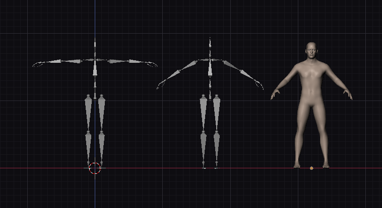
These poses make it easier to model characters and ensure that their body-parts aren't connected.
I'm disappointed that I made this mistake, however we will be creating a base body for all characters based on the body shape mentioned above, which will be modelled separately. Whilst the turnarounds can't be used for exactly translating an image into a model, they do give a 360 degree view of the character that will still aid in the modelling process, and set a neat standard for all of the characters.


Comments